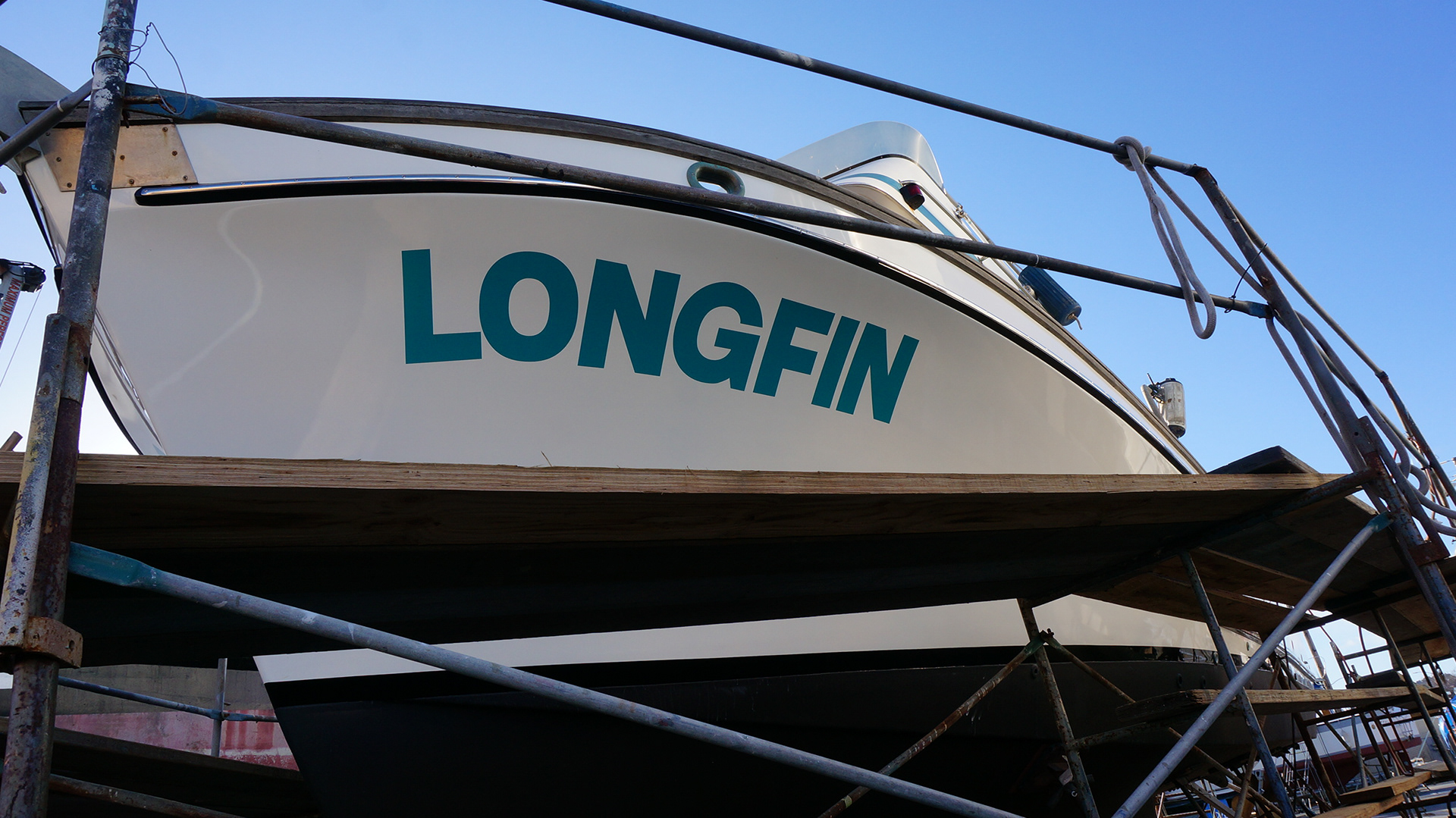
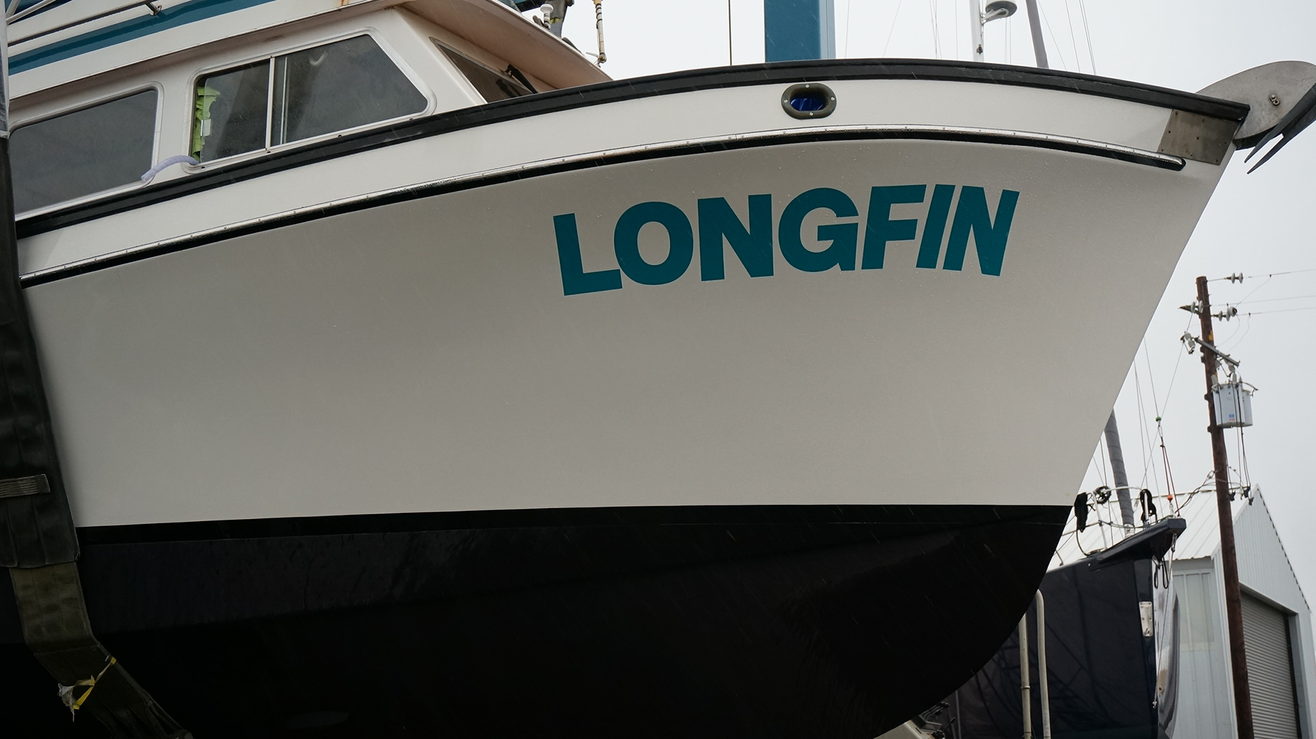
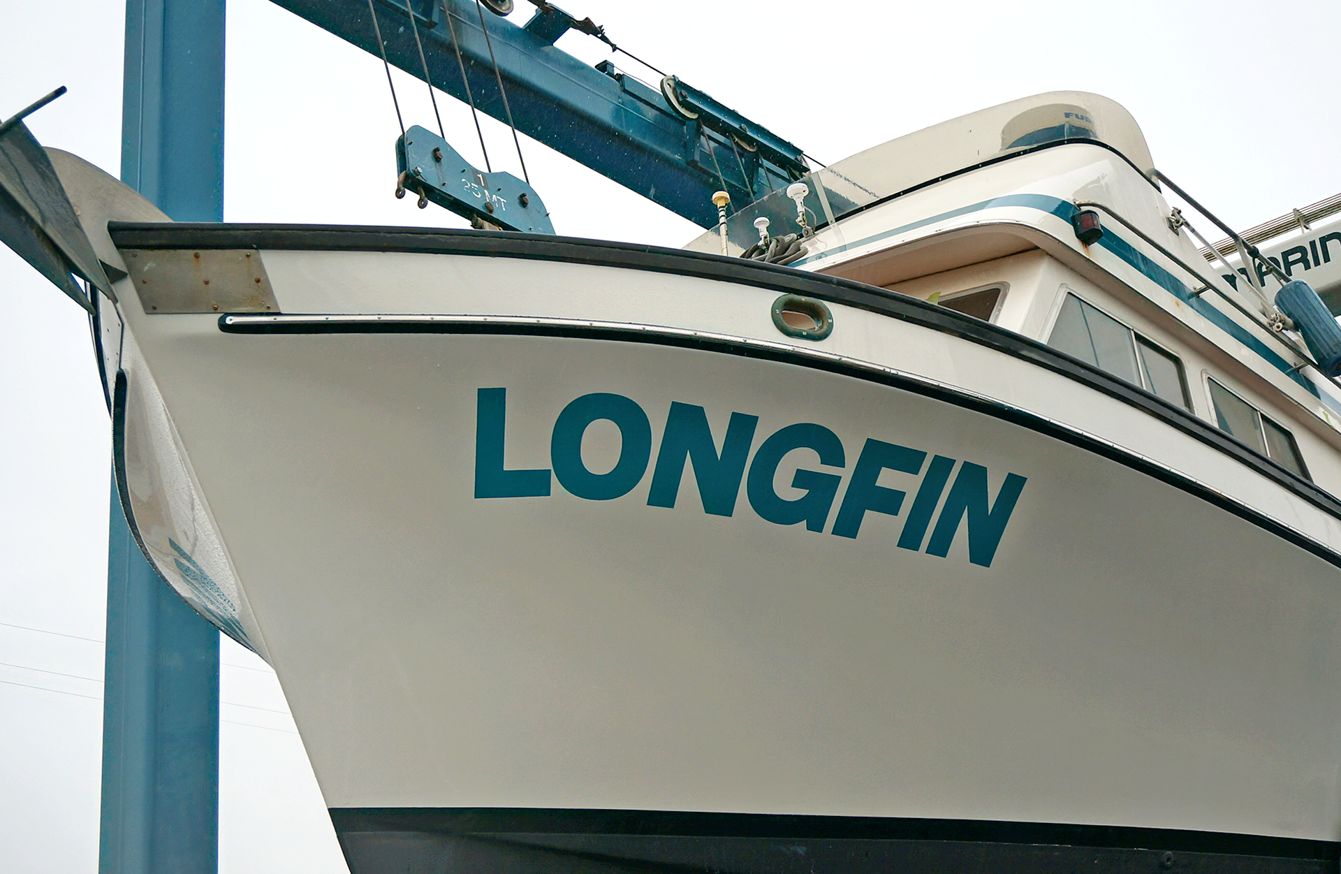
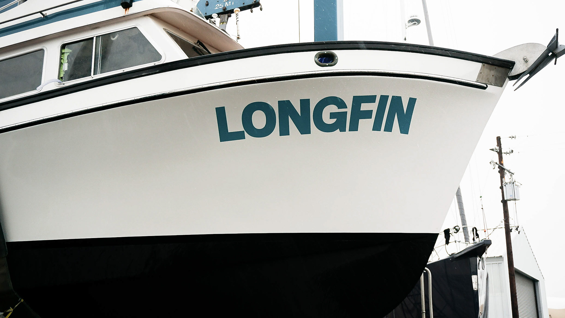
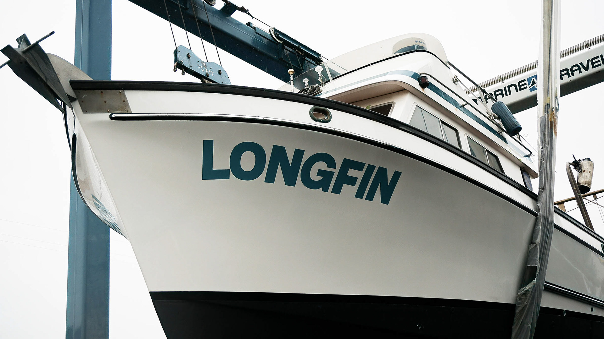
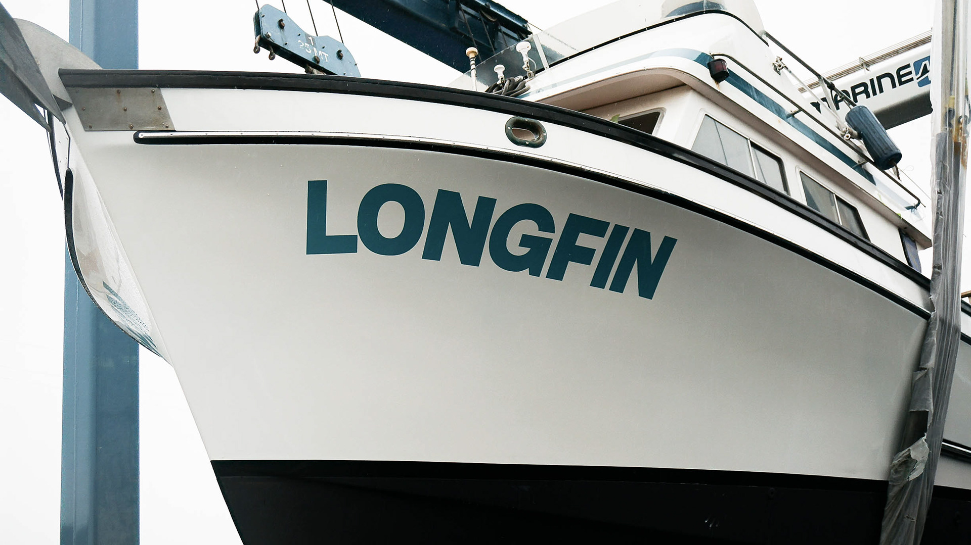
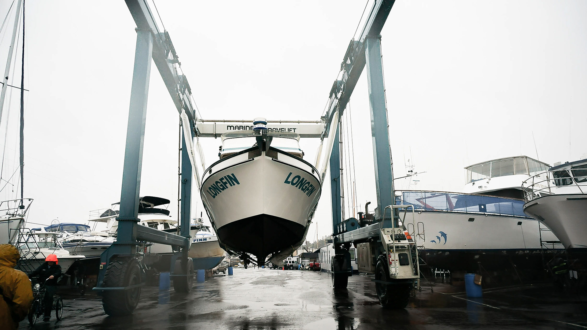
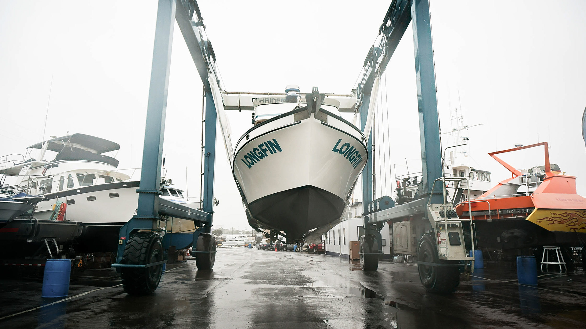
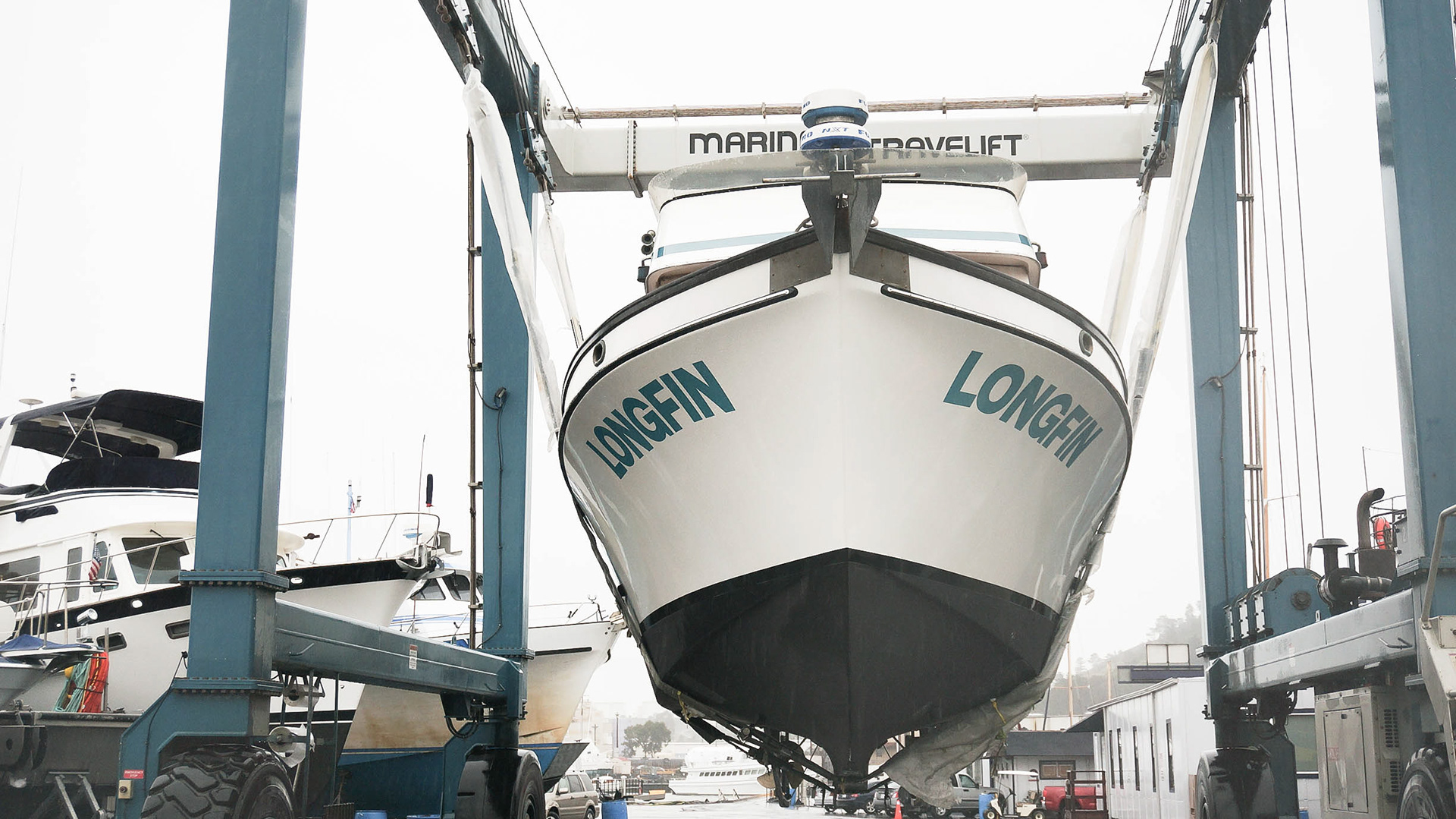
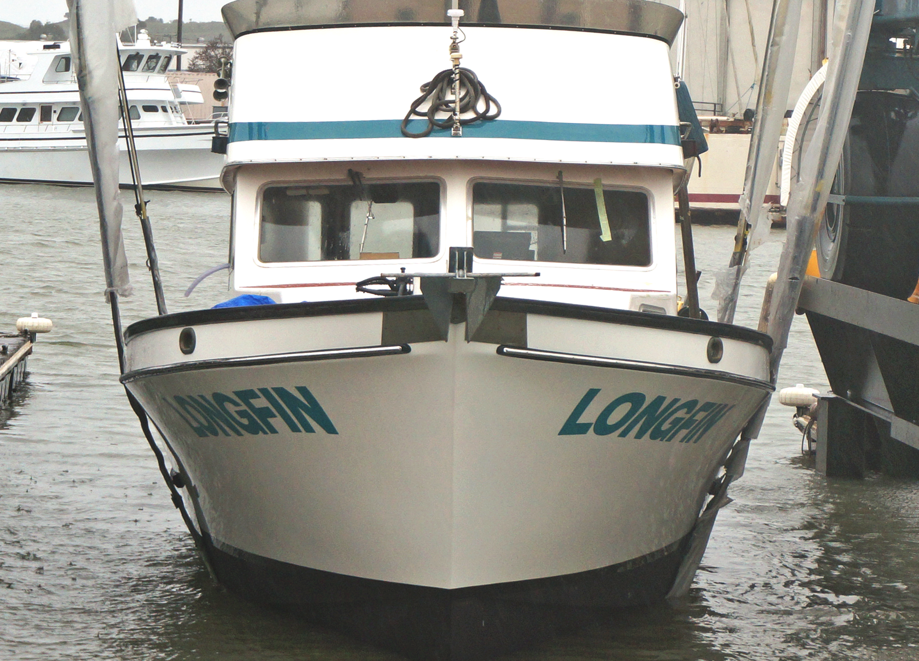
This commercial fishing vessel underwent a complete refit in the fall of 2018, and winter of 2019. She was completely re-powered, all new hydraulics, wiring, electronics, onboard systems, and bottom paint along with new Awlgrip topsides. The boat was essentially rebuilt - which wound up to be more practical than buying a new boat. New boats can take a significant amount of time to build, and cost exponentially more. We were called in to replace the original painted lettering with high performance vinyl.
The first task involves matching (as close as possible) the original typography with a production font. Lots of commercial vessels use lettering from a common production font: good old Arial in bold. With the text vectorized on editable paths, we can reformulate the Arial bold base lettering to match the lettering painted on the boat.
We then overlay the vectorized production font version on top of the lettering forms and shapes that appear on the boat, gridding every aspect of the lettering that may need to be reshaped. From here we see that we'll need to increase letter height and redraw the descender in the "G" and position of the cross stems in the "F".
Once the letter forms have been redrawn to match the original typography, we lay them out on the curvature splines we prepared from measurements taken at the boat. While these curves are quite similar from boat to boat, every boat is different so we carefully trace the lines on each boat. We note all the corrections that need to be made.
Now comes the fine tuning. Each letter is inspected against the spline and reshaped as necessary to conform to the curve spline. We balance all the kerning (letter spacing) and compensate for optical effects of rotation by angling the upper and lower terminals of stems such as in the "F" and "I". We also balance optical effects of rounded letters - in the this case the "O" and "G" so that their upper and lower apex is pulled high and low enough to balance with neighboring letters. We modeled the curve splines to move the decal forward from its original position - giving it a bit more of a dramatic flair - with stronger curvature forward and a nice bow-on composition.
