A new Beneteau Oceanis 45 was being commissioned in San Francisco and in need of some simple graphics. The name for the boat had been decided, and it would be the name of one of the family member's start-up company. Great opportunity for branding!
The company's logo was supplied and the design brief was to complement the logo and the hull color, and match hull accent details - specifically the cove stripe.
We worked up a series of letter treatments, but ultimately went with the original company logo. The logo was well executed and would look great in its original form. We adapted the logo and name for the transom and added the hailing port in complementary lettering form.
It seems there are new forms of vinyl/film emerging almost weekly, and that includes over-laminates. To best complement the look of the hull paint and accents, we color matched the cove stripe paint and chose a textured matte over-laminate for the graphic.
We enjoyed working on this project with a wonderful family, and fellow yacht club members.
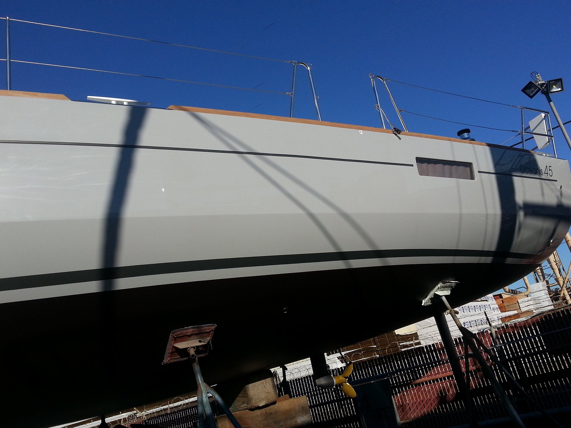
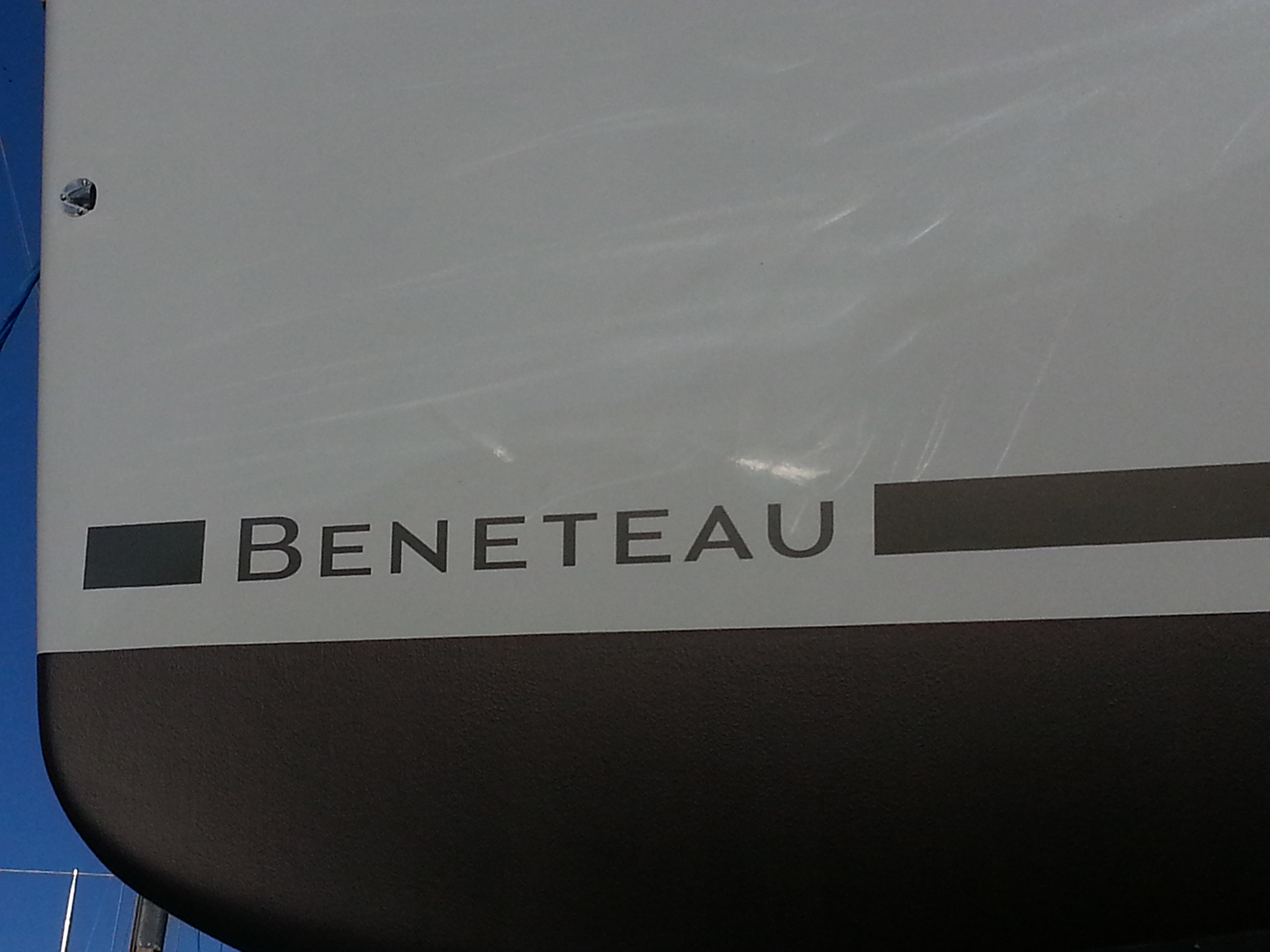
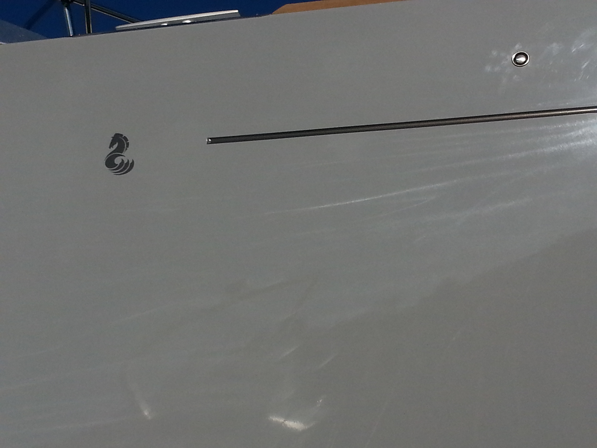
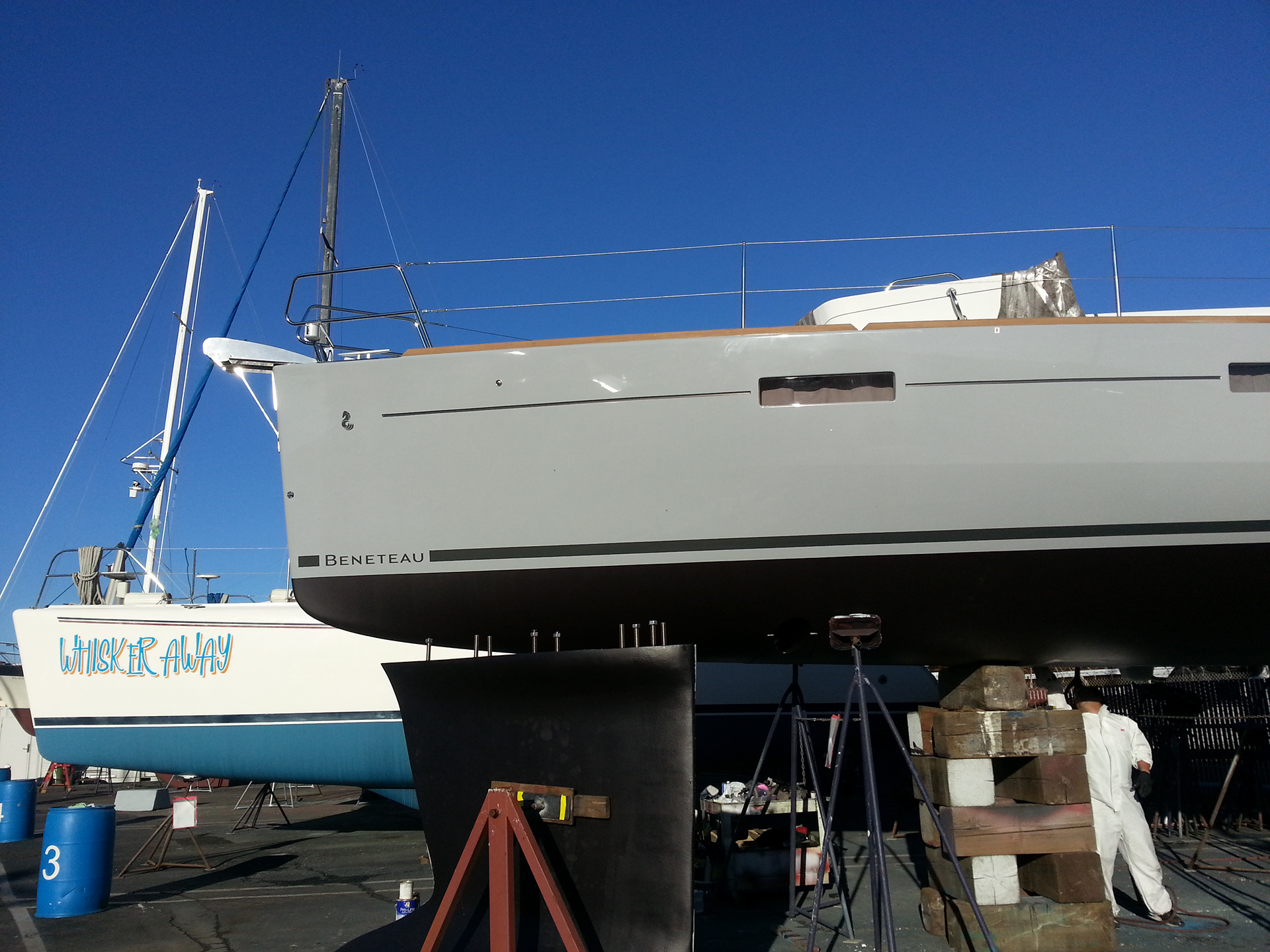
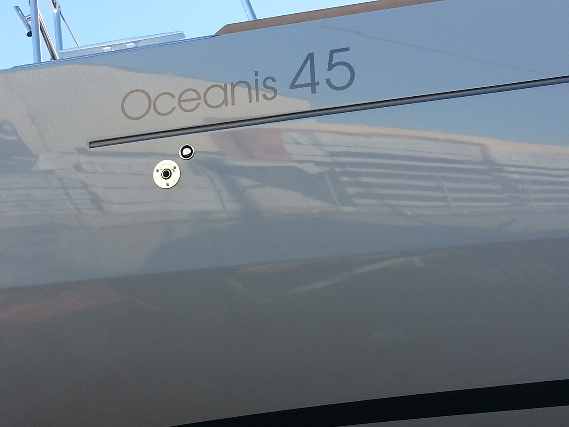
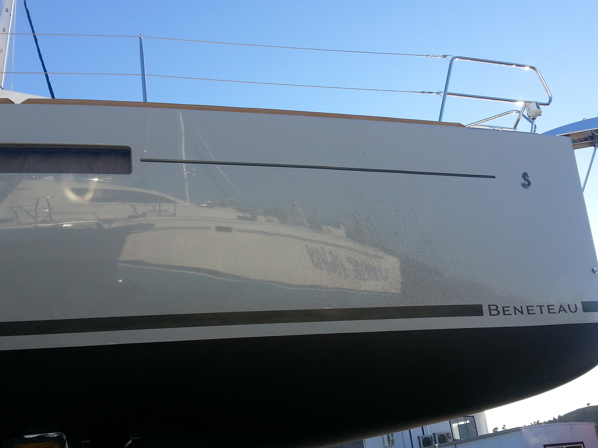
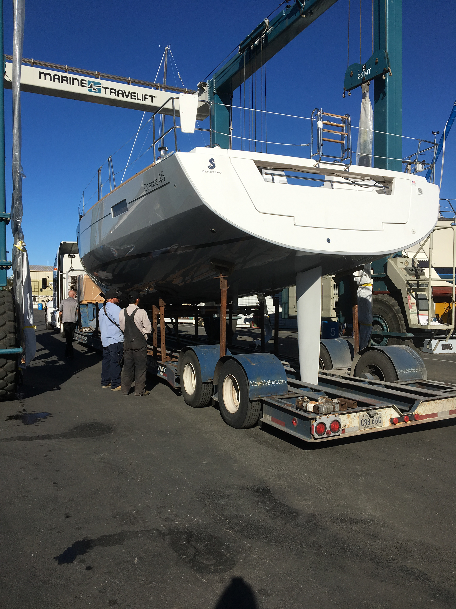
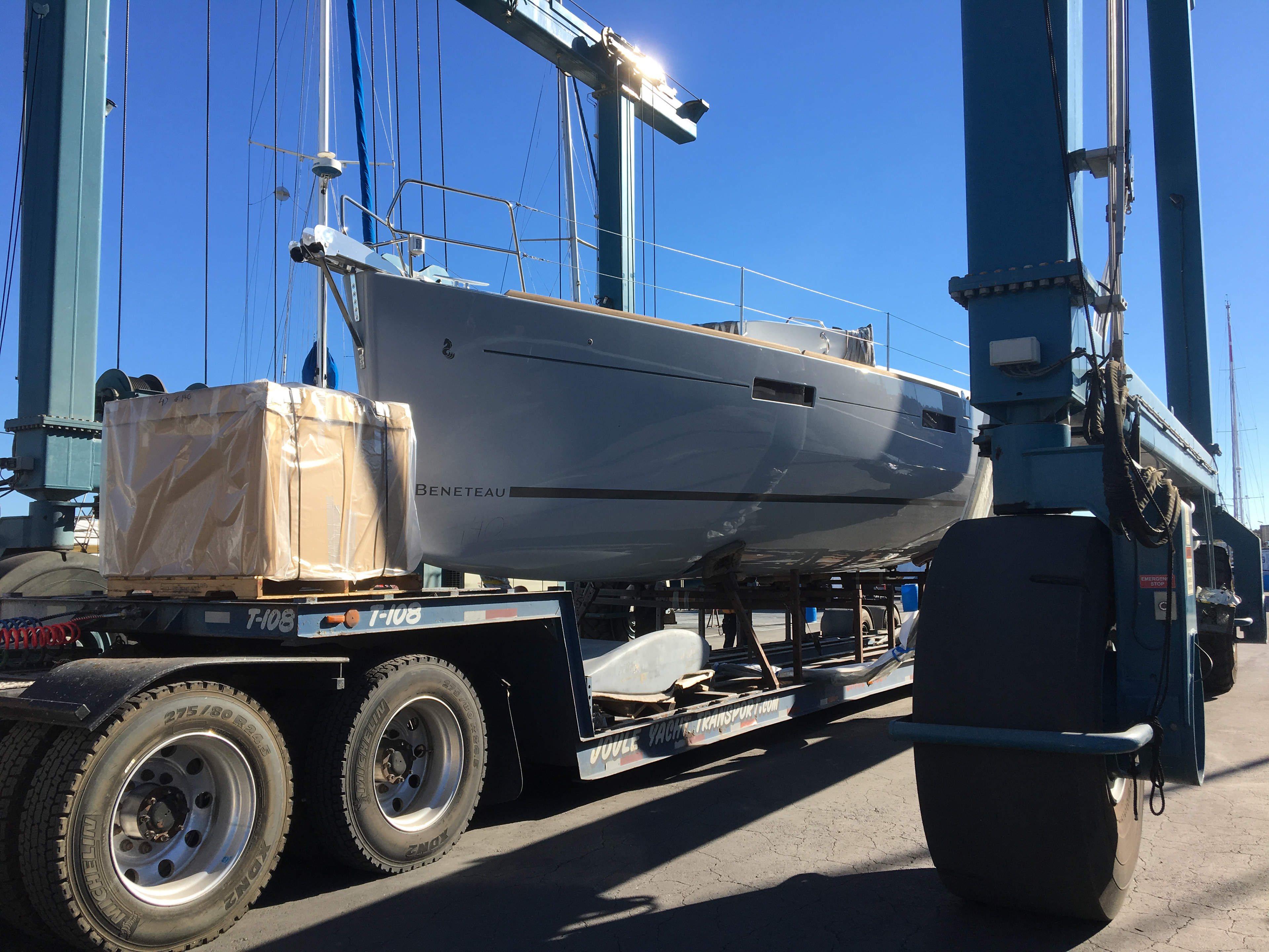
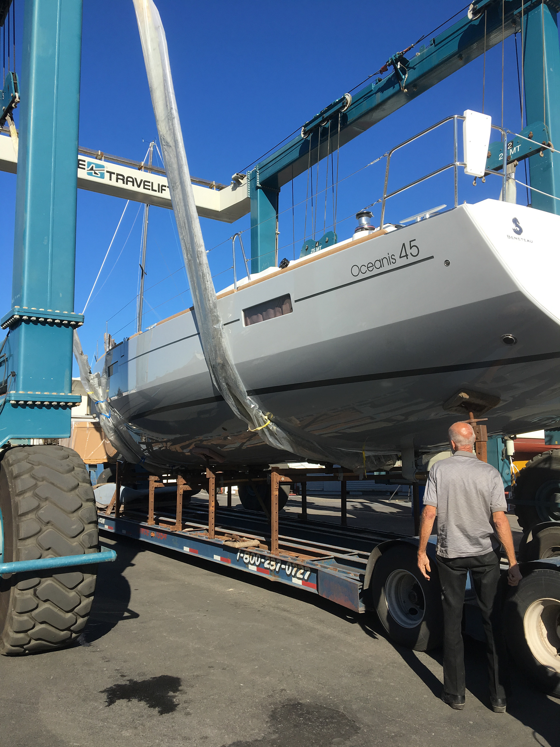
First step on any project is a photo survey of the boat. This helps determine sizing and placement of the graphics and color values. Beneteau heavily brands their boats so we needed to consider locations that would not compete or be overshadowed by the Beneteau markings.
From here we work up a set of typography concepts and text effect concepts. For this project we would only be using a flat matte dark graphite color.
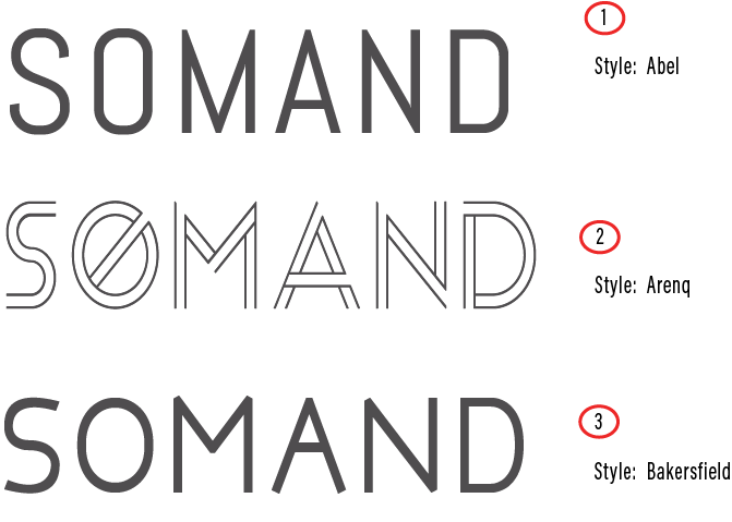
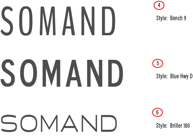
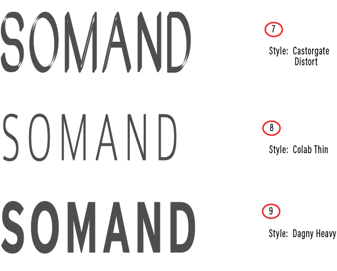
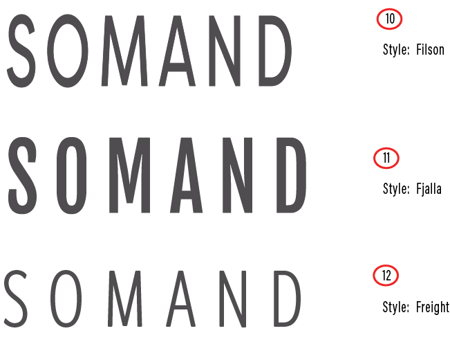
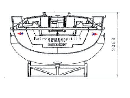
Since the typography in the original logo was nicely executed, we decided to stick with that and resize the original logo's bug to work better on the boat graphic. We'd determined the optimal location for the hull side graphics and sizing would be no issue. With the limited real estate to work with on the transom however; we dug out the line drawings for the boat and ran some scaling calc's to determine best sizing for the transom. From here we ran a mock-up of the transom position and sizing.
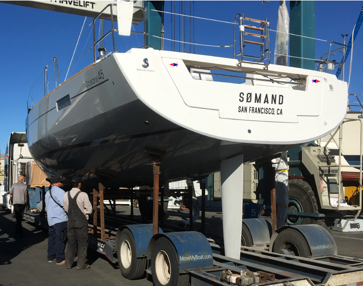
With the art and sizing finalized, it was off to print for the vinyl. We would be doing an in-water installation which we frequently do. All very straight forward, but we'd need to tweak the positioning of the burgees to counter the 'optical delusion' created by centering the burgees amidst slanted transom edges. Just a couple of degrees of rotation did the trick. The graphics came out great!
