
We love challenges and this project had two key ones - getting the coloring right for the lettering - and formulating a nautilus graphic that complimented the letter coloring and added depth and luster.
The creative brief called for developing an overall graphic that would span almost the full width of the transom and for the lettering to graduate from light to dark to match the hull color of the boat. We'd need to work with the transom form which featured an asymmetrical set up of a refrigerator door on the left and panel on the right.
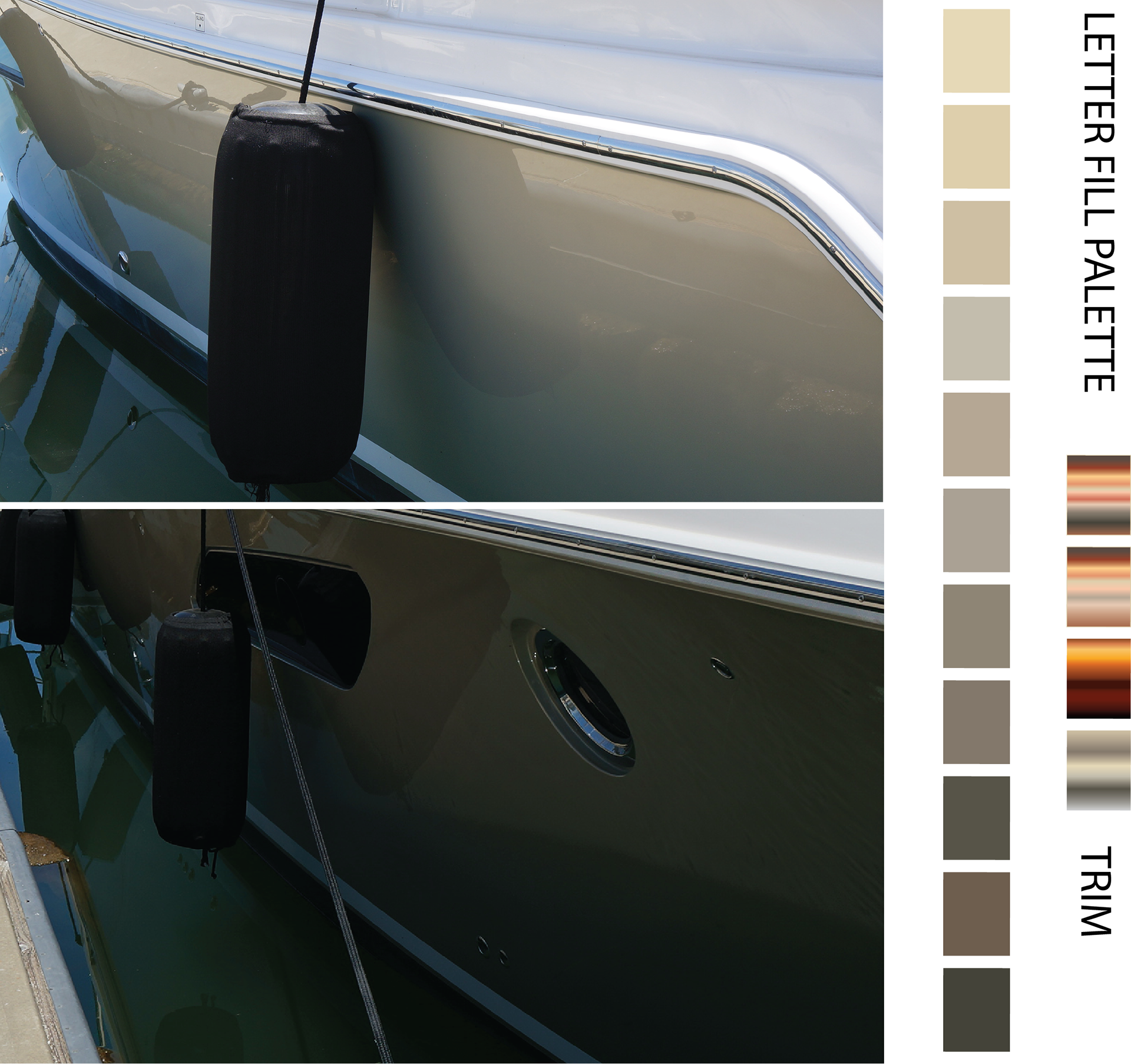
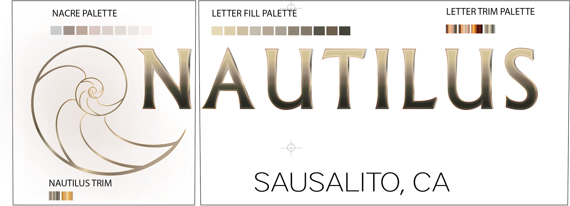
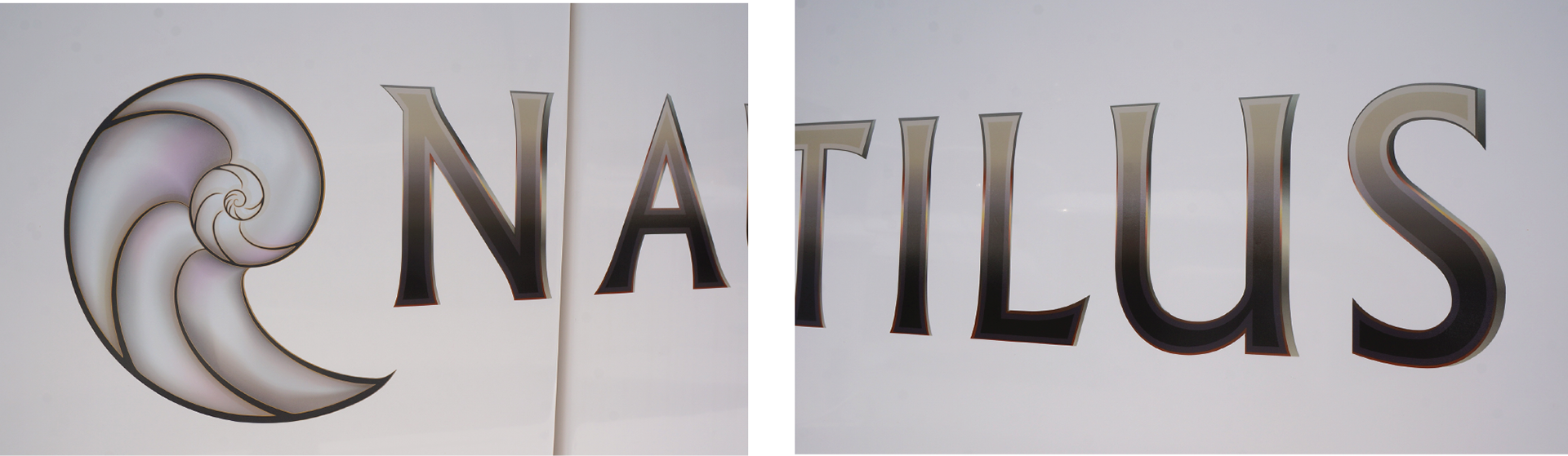
The first step was to develop a palette of colors that covered the highlights, mid-tones, and lowlights of the hull color - based on an Aston Martin paint treatment - silver blonde. This paint had a very wide luminosity bracket and graduated from a pale sand color in direct light to a dark bronze in shadow. This palette would require some trim treatments that would give some depth and highlighting to the lettering.
We then needed to develop a color array for the nautilus that would be complementary to the lettering palette but still allow the nautilus to stand out on its own as a graphic element - for this we went with a comp. for the nautilus fill in a nacre depiction.
Typically, we'll start out projects by providing several compositions for the client to review - and they are usually done in 8.5" x 11" format and submitted as .pdfs. For this project we started by modeling the transom configuration at scale so that we would know exactly where and how to space and size the lettering along with the graphic element.
A standard gradient was simply not going to work for the fill in the nautilus. The colors needed to swirl in the same direction as the different nautilus chambers, and we'd need to add a few colors to the palette to use as highlights. We'd need to build a gradient mesh to get the direction flow of color correct. While gradient meshes are beautiful, they are very difficult to print. The changes in color in each color flow are subtle and not always picked up on the press. We'd need to run proofs before committing this decal to final printing.
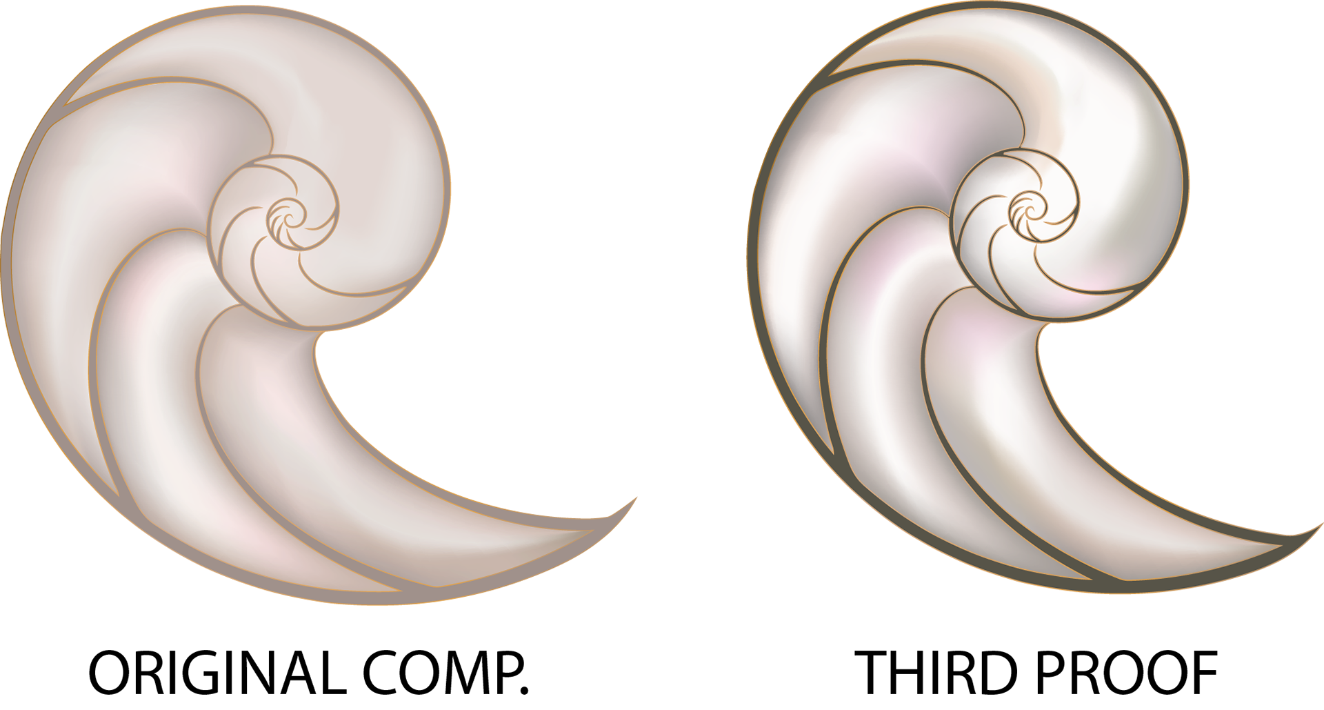
The proofing process showed that the highlights really needed to be pulled up as well as the low lights. We added a few colors to the flow palette to make it warmer and provide depth. The nautilus shell frame was darkened and the nautilus rotated slightly to give the overall decal better geometry.

To get the letters to 'pop' and provide depth, we added a letter fill inset whose gradation was a few clicks darker than the overall fill and set the copper highlights at the midpoint and foot while aligning the back shadow highlights to the copper highlights.
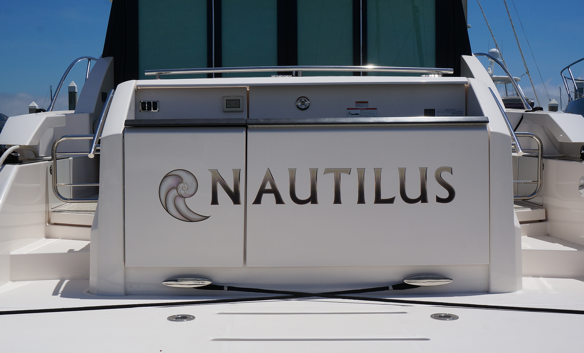
The install would need to be surgical as we had some variants in transom panel height that needed to be compensated for. Our curve check indicated that we wouldn't have deviation in the lettering itself, but the beginning and trailing letters would need to be individually set to achieve an optically pleasing alignment.
It would be a two week wait sitting out the relentless San Francisco summer breeze to get a window of calm in which to apply this decal which involved individual letter movement by as little as 2mm in tip height and rotation. We're happy with the results! A great lay down and result in colorways.